MAGNETIC DESIGN SYSTEM
STREAMLINING ALERTS ACROSS CISCO SECURITY AND NETWORKING
As Cisco's product teams faced challenges in managing consistent system-wide alerts across multiple platforms, the need for a unified product-level notification component became evident. I took ownership of this project 0-1, and this component is now integrated into the Cisco Magnetic Design System, serving over 40 product teams across Cisco Security and Networking.
UX DESIGN INTERN
PRODUCT DESIGN
DESIGN SYSTEMS
IA/UI/UX
USER RESEARCH
GUIDELINE CREATION
ROLE
UX DESIGN INTERN
TIMELINE
JUN - SEP 2023
TEAM
MAGNETIC DESIGN SYSTEM

CONCEPT
RESEARCH
LEARNING FROM THE BEST
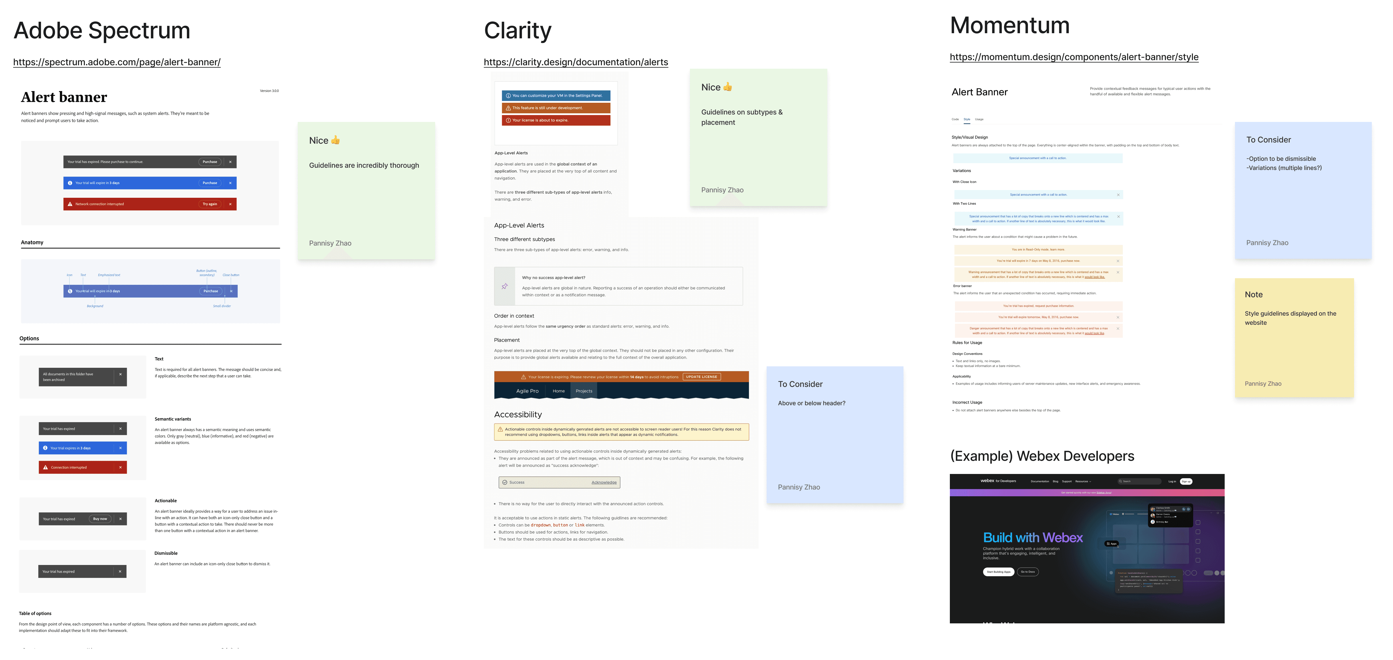
I researched how leading design systems handle product-level notifications, analyzing dismissibility options, different alert types (i.e. error, warning), placement, and color schemes. These insights helped me establish considerations and weigh the pros and cons of each approach before diving into my own design explorations.
SECONDARY RESEARCH
FIRST ITERATION
EXPLORING ALL THE OPTIONS
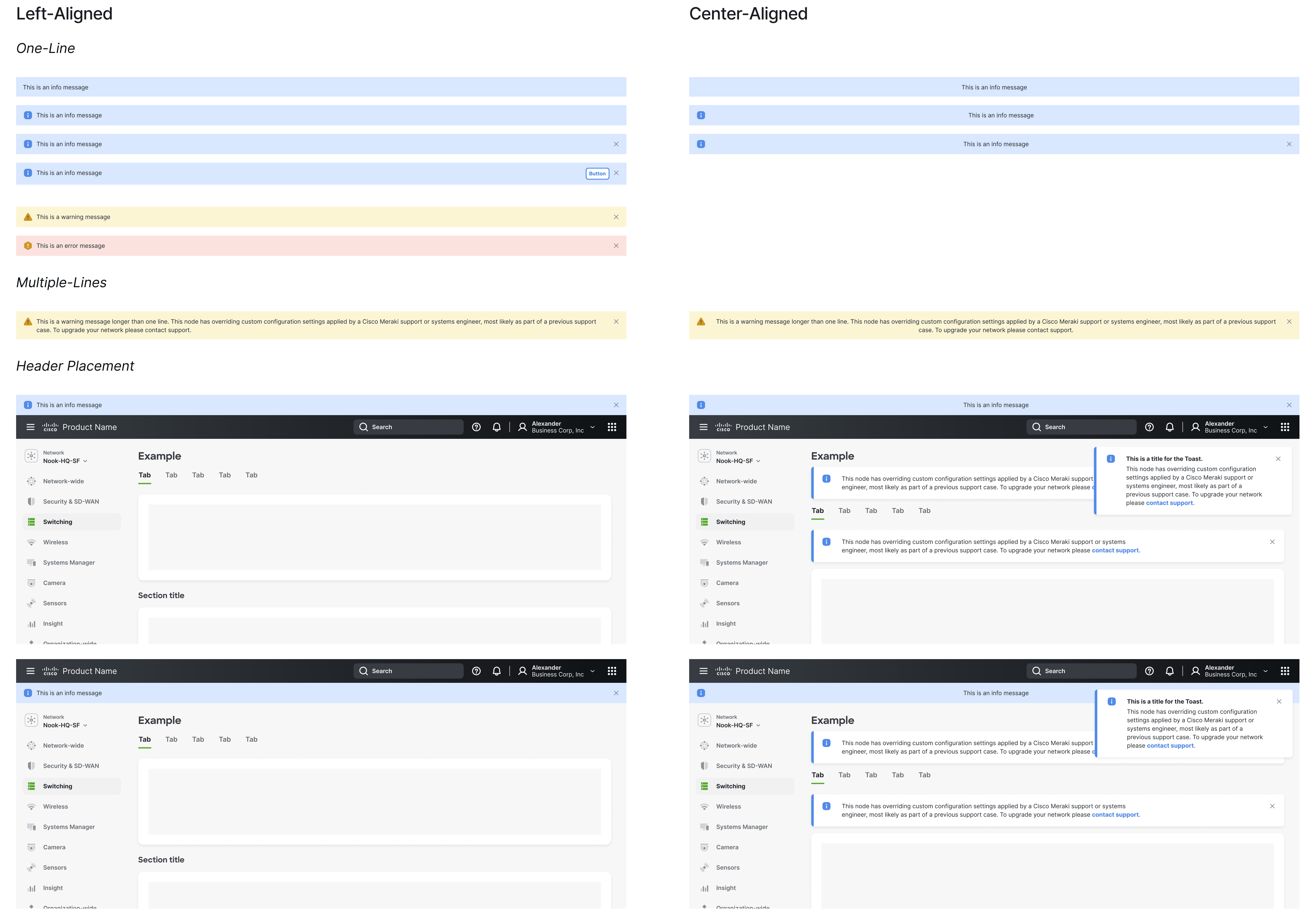
For the first iteration, I explored various possibilities—left and center alignment, a light color scheme, different header placements, and the addition of links, icons, and dismissibility. This phase was all about testing ideas, and after a round of feedback, I was eager to refine the idea of center alignment despite our usual left-aligned approach.
FIRST ITERATION
SECOND ITERATION
WHAT IF THEY STACK UP?
In the second iteration, I focused on refining center alignment with a below-header placement to improve visual hierarchy, testing it with longer lines of text, titles, and different color schemes. I experimented with inverted colors, ensuring accessibility by selecting the lightest shades that passed contrast scans.
Observing that stacking crowds the page quickly, I explored more creative ways to handle multiple notifications such as expandable notifications and a carousel.

SECOND ITERATION
THIRD ITERATION
ENHANCING READABILITY AND "MAGNETICITY"
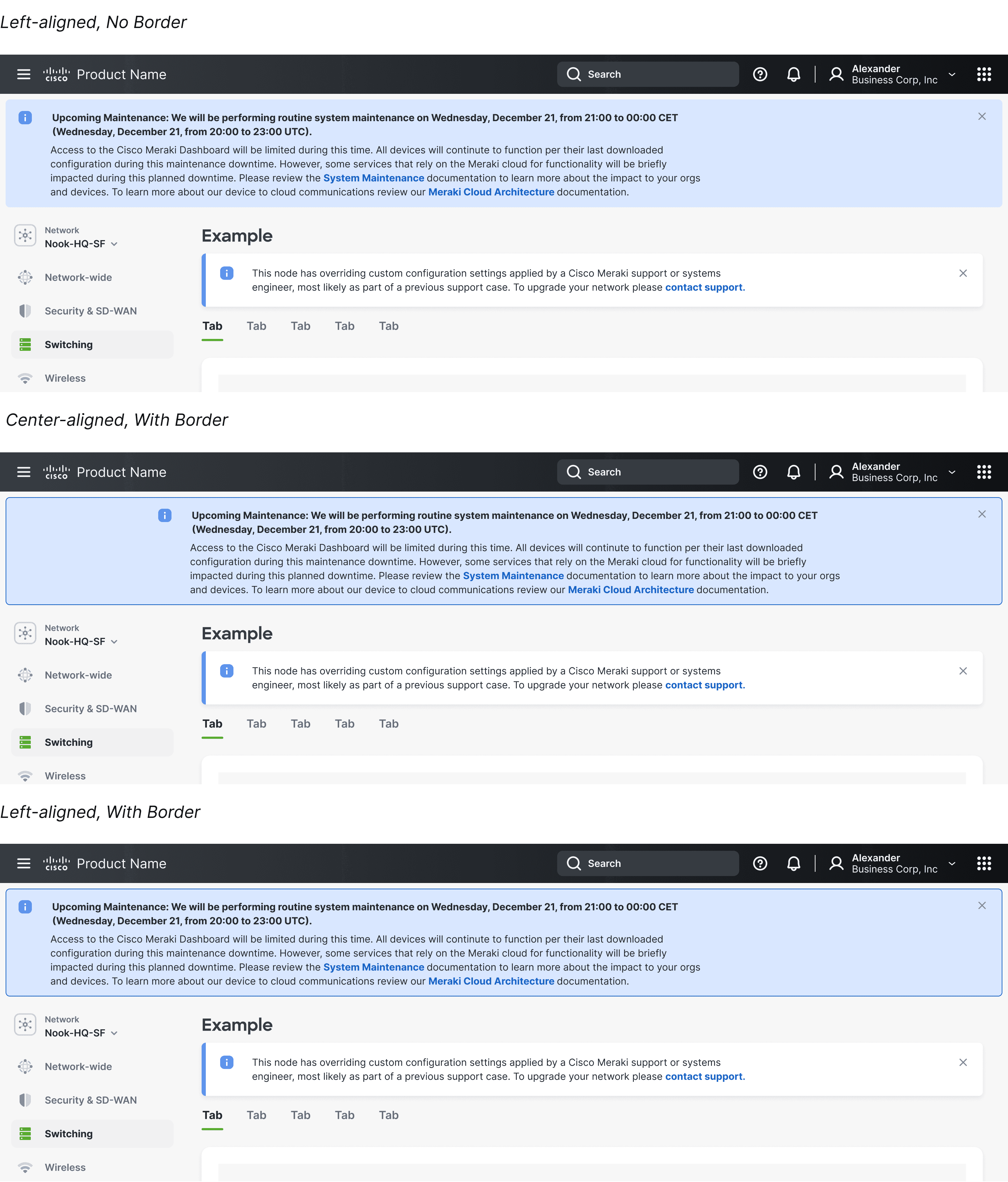
In this third iteration, I settled on the light standard color scheme due to readability concerns with the inverted palette. To make the design feel more "Magnetic," I redesigned the notification to be a dropdown banner and experimented with a border and rounded corner style. Incorporating real-world text from an actual product-level notification, I also improved readability by left-aligning text within centered banners. This round was all about narrowing in on the details.
THIRD ITERATION
REFINE & USER RESEARCH
FINALIZING DESIGN AND CIRCLING BACK TO OPEN QUESTIONS
I ultimately settled on left alignment with the dropdown design, as it proved more versatile for longer text compared to centered alignment which struggled with max-width constraints. The team unanimously approved this approach, and the product-level notification was ready to be built—at least for a single notification.
One key question remained unanswered: how should we handle multiple notifications at once? Should we stack or expand them? Should there be a maximum number? To answer these questions, I decided to go straight to our users.

UX RESEARCH
FINDINGS
UNDERSTANDING NEEDS THROUGH RESEARCH
I interviewed seven product teams to better understand their need for a product-level notification component. Beyond exploring their current setups, my main goal was to understand how many notifications they typically encounter at once.
Findings showed that most teams urgently need a product-level notification component and have been misusing the banner component as a workaround. On average, they expect 2-3 notifications at once, though some products like Duo, where users do not log in frequently, could potentially see more notifications stacking up over time.

REQUIREMENTS SYNTHESIS
FINAL ITERATION
SCALING UP WITH EXPANDABLE NOTIFICATIONS
In the final iteration, I focused on designing an expandable/collapsible variant to handle scenarios where more than three notifications stack up. This solution keeps the interface clean by allowing users to prioritize and resolve urgent alerts without overwhelming the page. While stacking more than three notifications is unlikely, I wanted to create a scalable solution that accommodates all teams' needs, ensuring the design could handle any situation effectively.

FINAL ITERATION
COMPONENT BUILD
PIXEL-PERFECT EXECUTION
With the design finalized, I moved on to building the component, its variants, and the final prototype, ensuring everything was pixel-perfect before handing it off to engineering. Nothing was by accident.

PROTOTYPE
GUIDELINES
WHEN 40+ TEAMS ARE INVOLVED, RULES ARE NECESSARY
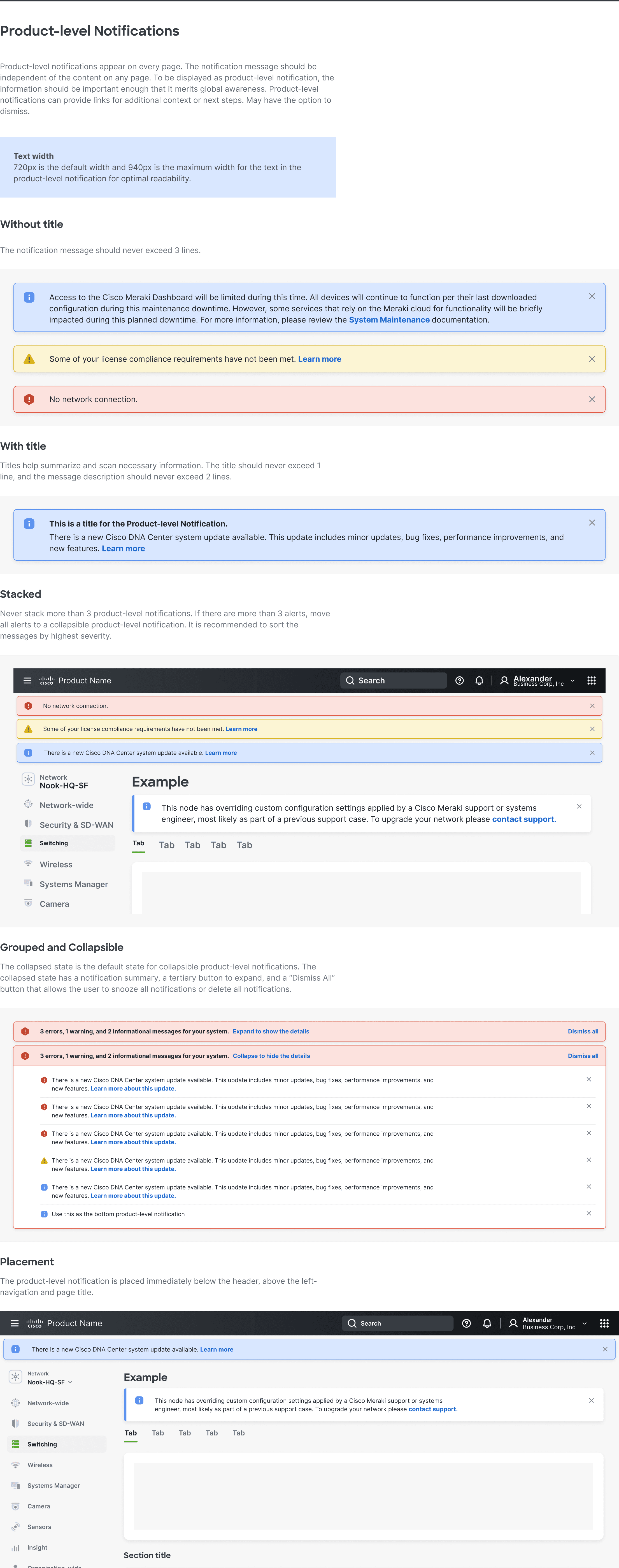
I created comprehensive guidelines to ensure consistent implementation of the product-level notification component. Key considerations included visibility, text limitations, and handling multiple notifications, all aimed at maintaining clarity and usability across 40+ Cisco products.
GUIDELINES
FINAL SOLUTION
PRODUCT-LEVEL NOTIFICATIONS
The product-level notification component ensures that critical alerts are displayed consistently across all Cisco Security and Networking products. The notifications are left-aligned, with rounded corners and a light standard color palette, ensuring they are both visually distinct and aligned with Magnetic's design principles.
The "Without Title" variant keeps things minimal, focusing on the core message without extra headings. This variant works best when quick, straightforward communication is key.

WITHOUT TITLE
—
CONTEXT AT A GLANCE
Titles give users a quick, clear snapshot of alerts, helping them prioritize instantly for longer notifications. It's all about helping users stay on top of things without digging through details.

WITH TITLE
—
CLEAN AND CLUTTER FREE
Collapsible notifications keep things tidy by showing only what’s necessary. Users can expand when they’re ready, staying in control of their workspace and focused on what matters. These grouped notifications are required for instances where more than three alerts need to be shown at the same time.

EXPANDABLE & COLLAPSIBLE
—
PLACED FRONT AND CENTER
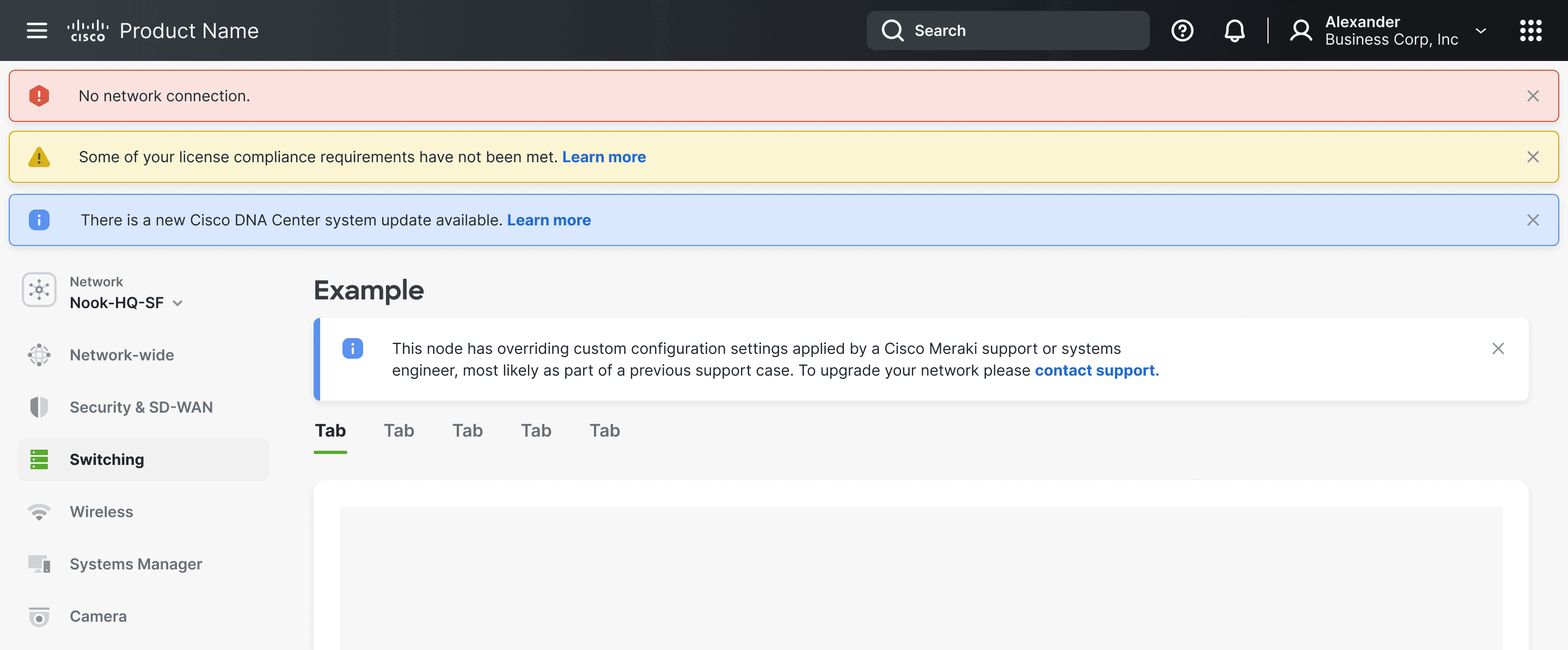
Positioned below the header, notifications stay prominent without disrupting the navigation or page content. They stack up to three and are sorted by urgency, keeping alerts visible but the interface clean.
STACKED
REFLECTION
THE SECRET OF LIFE IS TO LEARN
Working on this project was a fascinating deep dive into the design systems process. To be a design systems designer is to manage dozens of teams and products at once, to value pixel-perfect precision, and to make a broad impact.
LEARNING 1: IT'S HARD TO CONVINCE EXPERTS OF DOING THINGS DIFFERENTLY
LEARNING 2: USERS ARE THE QUICKEST WAY TO VALIDATE
LEARNING 3: SO MUCH BEAUTY IN THE DETAILS
With more time, I would collaborate with the UX researchers to validate before handing off to engineers to ensure that the component is functional and intuitive across all use cases.
Thanks for stopping by! Feel free to take a peek at some of my other work or reach out — I'd love to chat.
MAGNETIC DESIGN SYSTEM
STREAMLINING ALERTS ACROSS CISCO SECURITY AND NETWORKING
As Cisco's product teams faced challenges in managing consistent system-wide alerts across multiple platforms, the need for a unified product-level notification component became evident. I took ownership of this project 0-1, and this component is now integrated into the Cisco Magnetic Design System, serving over 40 product teams across Cisco Security and Networking.
UX DESIGN INTERN
PRODUCT DESIGN
DESIGN SYSTEMS
IA/UI/UX
USER RESEARCH
GUIDELINE CREATION
ROLE
UX DESIGN INTERN
TIMELINE
JUN - SEP 2023
TEAM
MAGNETIC DESIGN SYSTEM


CONCEPT
RESEARCH
LEARNING FROM THE BEST
I researched how leading design systems handle product-level notifications, analyzing dismissibility options, different alert types (i.e. error, warning), placement, and color schemes. These insights helped me establish considerations and weigh the pros and cons of each approach before diving into my own design explorations.


SECONDARY RESEARCH
FIRST ITERATION
EXPLORING ALL THE OPTIONS
For the first iteration, I explored various possibilities—left and center alignment, a light color scheme, different header placements, and the addition of links, icons, and dismissibility. This phase was all about testing ideas, and after a round of feedback, I was eager to refine the idea of center alignment despite our usual left-aligned approach.


FIRST ITERATION
SECOND ITERATION
WHAT IF THEY STACK UP?
In the second iteration, I focused on refining center alignment with a below-header placement to improve visual hierarchy, testing it with longer lines of text, titles, and different color schemes. I experimented with inverted colors, ensuring accessibility by selecting the lightest shades that passed contrast scans.
Observing that stacking crowds the page quickly, I explored more creative ways to handle multiple notifications such as expandable notifications and a carousel.


SECOND ITERATION
THIRD ITERATION
ENHANCING READABILITY AND "MAGNETICITY"
In this third iteration, I settled on the light standard color scheme due to readability concerns with the inverted palette. To make the design feel more "Magnetic," I redesigned the notification to be a dropdown banner and experimented with a border and rounded corner style. Incorporating real-world text from an actual product-level notification, I also improved readability by left-aligning text within centered banners. This round was all about narrowing in on the details.


THIRD ITERATION
REFINE & USER RESEARCH
FINALIZING DESIGN AND CIRCLING BACK TO OPEN QUESTIONS
I ultimately settled on left alignment with the dropdown design, as it proved more versatile for longer text compared to centered alignment which struggled with max-width constraints. The team unanimously approved this approach, and the product-level notification was ready to be built—at least for a single notification.
One key question remained unanswered: how should we handle multiple notifications at once? Should we stack or expand them? Should there be a maximum number? To answer these questions, I decided to go straight to our users.


UX RESEARCH
FINDINGS
UNDERSTANDING NEEDS THROUGH RESEARCH
I interviewed seven product teams to better understand their need for a product-level notification component. Beyond exploring their current setups, my main goal was to understand how many notifications they typically encounter at once.
Findings showed that most teams urgently need a product-level notification component and have been misusing the banner component as a workaround. On average, they expect 2-3 notifications at once, though some products like Duo, where users do not log in frequently, could potentially see more notifications stacking up over time.


REQUIREMENTS SYNTHESIS
FINAL ITERATION
SCALING UP WITH EXPANDABLE NOTIFICATIONS
In the final iteration, I focused on designing an expandable/collapsible variant to handle scenarios where more than three notifications stack up. This solution keeps the interface clean by allowing users to prioritize and resolve urgent alerts without overwhelming the page. While stacking more than three notifications is unlikely, I wanted to create a scalable solution that accommodates all teams' needs, ensuring the design could handle any situation effectively.


FINAL ITERATION
COMPONENT BUILD
PIXEL-PERFECT EXECUTION
With the design finalized, I moved on to building the component, its variants, and the final prototype, ensuring everything was pixel-perfect before handing it off to engineering. Nothing was by accident.


PROTOTYPE
GUIDELINES
WHEN 40+ TEAMS ARE INVOLVED, RULES ARE NECESSARY
I created comprehensive guidelines to ensure consistent implementation of the product-level notification component. Key considerations included visibility, text limitations, and handling multiple notifications, all aimed at maintaining clarity and usability across 40+ Cisco products.


GUIDELINES
FINAL SOLUTION
PRODUCT-LEVEL NOTIFICATIONS
The product-level notification component ensures that critical alerts are displayed consistently across all Cisco Security and Networking products. The notifications are left-aligned, with rounded corners and a light standard color palette, ensuring they are both visually distinct and aligned with Magnetic's design principles.
The "Without Title" variant keeps things minimal, focusing on the core message without extra headings. This variant works best when quick, straightforward communication is key.


WITHOUT TITLE
—
CONTEXT AT A GLANCE
Titles give users a quick, clear snapshot of alerts, helping them prioritize instantly for longer notifications. It's all about helping users stay on top of things without digging through details.


WITH TITLE
—
CLEAN AND CLUTTER FREE
Collapsible notifications keep things tidy by showing only what’s necessary. Users can expand when they’re ready, staying in control of their workspace and focused on what matters. These grouped notifications are required for instances where more than three alerts need to be shown at the same time.


EXPANDABLE & COLLAPSIBLE
—
PLACED FRONT AND CENTER
Positioned below the header, notifications stay prominent without disrupting the navigation or page content. They stack up to three and are sorted by urgency, keeping alerts visible but the interface clean.


STACKED
REFLECTION
THE SECRET OF LIFE IS TO LEARN
Working on this project was a fascinating deep dive into the design systems process. To be a design systems designer is to manage dozens of teams and products at once, to value pixel-perfect precision, and to make a broad impact.
LEARNING 1: IT'S HARD TO CONVINCE EXPERTS OF DOING THINGS DIFFERENTLY
LEARNING 2: USERS ARE THE QUICKEST WAY TO VALIDATE
LEARNING 3: SO MUCH BEAUTY IN THE DETAILS
LEARNING 1: IT'S HARD TO CONVINCE EXPERTS OF DOING THINGS DIFFERENTLY
LEARNING 2: USERS ARE THE QUICKEST WAY TO VALIDATE
LEARNING 3: SO MUCH BEAUTY IN THE DETAILS
With more time, I would collaborate with the UX researchers to validate before handing off to engineers to ensure that the component is functional and intuitive across all use cases.
Thanks for stopping by! Feel free to take a peek at some of my other work or reach out — I'd love to chat.
MAGNETIC DESIGN SYSTEM
STREAMLINING ALERTS ACROSS CISCO SECURITY AND NETWORKING
As Cisco's product teams faced challenges in managing consistent system-wide alerts across multiple platforms, the need for a unified product-level notification component became evident. I took ownership of this project 0-1, and this component is now integrated into the Cisco Magnetic Design System, serving over 40 product teams across Cisco Security and Networking.
UX DESIGN INTERN
PRODUCT DESIGN
DESIGN SYSTEMS
IA/UI/UX
USER RESEARCH
GUIDELINE CREATION
ROLE
UX DESIGN INTERN
TIMELINE
JUN - SEP 2023
TEAM
MAGNETIC DESIGN SYSTEM


CONCEPT
RESEARCH
LEARNING FROM THE BEST
I researched how leading design systems handle product-level notifications, analyzing dismissibility options, different alert types (i.e. error, warning), placement, and color schemes. These insights helped me establish considerations and weigh the pros and cons of each approach before diving into my own design explorations.


SECONDARY RESEARCH
FIRST ITERATION
EXPLORING ALL THE OPTIONS
For the first iteration, I explored various possibilities—left and center alignment, a light color scheme, different header placements, and the addition of links, icons, and dismissibility. This phase was all about testing ideas, and after a round of feedback, I was eager to refine the idea of center alignment despite our usual left-aligned approach.


FIRST ITERATION
SECOND ITERATION
WHAT IF THEY STACK UP?
In the second iteration, I focused on refining center alignment with a below-header placement to improve visual hierarchy, testing it with longer lines of text, titles, and different color schemes. I experimented with inverted colors, ensuring accessibility by selecting the lightest shades that passed contrast scans.
Observing that stacking crowds the page quickly, I explored more creative ways to handle multiple notifications such as expandable notifications and a carousel.


SECOND ITERATION
THIRD ITERATION
ENHANCING READABILITY AND "MAGNETICITY"
In this third iteration, I settled on the light standard color scheme due to readability concerns with the inverted palette. To make the design feel more "Magnetic," I redesigned the notification to be a dropdown banner and experimented with a border and rounded corner style. Incorporating real-world text from an actual product-level notification, I also improved readability by left-aligning text within centered banners. This round was all about narrowing in on the details.


THIRD ITERATION
REFINE & USER RESEARCH
FINALIZING DESIGN AND CIRCLING BACK TO OPEN QUESTIONS
I ultimately settled on left alignment with the dropdown design, as it proved more versatile for longer text compared to centered alignment which struggled with max-width constraints. The team unanimously approved this approach, and the product-level notification was ready to be built—at least for a single notification.
One key question remained unanswered: how should we handle multiple notifications at once? Should we stack or expand them? Should there be a maximum number? To answer these questions, I decided to go straight to our users.


UX RESEARCH
FINDINGS
UNDERSTANDING NEEDS THROUGH RESEARCH
I interviewed seven product teams to better understand their need for a product-level notification component. Beyond exploring their current setups, my main goal was to understand how many notifications they typically encounter at once.
Findings showed that most teams urgently need a product-level notification component and have been misusing the banner component as a workaround. On average, they expect 2-3 notifications at once, though some products like Duo, where users do not log in frequently, could potentially see more notifications stacking up over time.


REQUIREMENTS SYNTHESIS
FINAL ITERATION
SCALING UP WITH EXPANDABLE NOTIFICATIONS
In the final iteration, I focused on designing an expandable/collapsible variant to handle scenarios where more than three notifications stack up. This solution keeps the interface clean by allowing users to prioritize and resolve urgent alerts without overwhelming the page. While stacking more than three notifications is unlikely, I wanted to create a scalable solution that accommodates all teams' needs, ensuring the design could handle any situation effectively.


FINAL ITERATION
COMPONENT BUILD
PIXEL-PERFECT EXECUTION
With the design finalized, I moved on to building the component, its variants, and the final prototype, ensuring everything was pixel-perfect before handing it off to engineering. Nothing was by accident.


PROTOTYPE
GUIDELINES
WHEN 40+ TEAMS ARE INVOLVED, RULES ARE NECESSARY
I created comprehensive guidelines to ensure consistent implementation of the product-level notification component. Key considerations included visibility, text limitations, and handling multiple notifications, all aimed at maintaining clarity and usability across 40+ Cisco products.


GUIDELINES
FINAL SOLUTION
PRODUCT-LEVEL NOTIFICATIONS
The product-level notification component ensures that critical alerts are displayed consistently across all Cisco Security and Networking products. The notifications are left-aligned, with rounded corners and a light standard color palette, ensuring they are both visually distinct and aligned with Magnetic's design principles.
The "Without Title" variant keeps things minimal, focusing on the core message without extra headings. This variant works best when quick, straightforward communication is key.


WITHOUT TITLE
—
CONTEXT AT A GLANCE
Titles give users a quick, clear snapshot of alerts, helping them prioritize instantly for longer notifications. It's all about helping users stay on top of things without digging through details.


WITH TITLE
—
CLEAN AND CLUTTER FREE
Collapsible notifications keep things tidy by showing only what’s necessary. Users can expand when they’re ready, staying in control of their workspace and focused on what matters. These grouped notifications are required for instances where more than three alerts need to be shown at the same time.


EXPANDABLE & COLLAPSIBLE
—
PLACED FRONT AND CENTER
Positioned below the header, notifications stay prominent without disrupting the navigation or page content. They stack up to three and are sorted by urgency, keeping alerts visible but the interface clean.


STACKED
REFLECTION
THE SECRET OF LIFE IS TO LEARN
Working on this project was a fascinating deep dive into the design systems process. To be a design systems designer is to manage dozens of teams and products at once, to value pixel-perfect precision, and to make a broad impact.
LEARNING 1: IT'S HARD TO CONVINCE EXPERTS OF DOING THINGS DIFFERENTLY
LEARNING 2: USERS ARE THE QUICKEST WAY TO VALIDATE
LEARNING 3: SO MUCH BEAUTY IN THE DETAILS
LEARNING 1: IT'S HARD TO CONVINCE EXPERTS OF DOING THINGS DIFFERENTLY
LEARNING 2: USERS ARE THE QUICKEST WAY TO VALIDATE
LEARNING 3: SO MUCH BEAUTY IN THE DETAILS
With more time, I would collaborate with the UX researchers to validate before handing off to engineers to ensure that the component is functional and intuitive across all use cases.
Thanks for stopping by! Feel free to take a peek at some of my other work or reach out — I'd love to chat.